Show, Not Tell: The Rise of the Infographic
Data visualizations are all the rage these days. Here’s a sampler of science-based ones to feed both your brain and your eyes.
One could argue that the progenitor to infographics (think, data + image) dates back 10,000 years, to a Native American carving of Idaho’s Snake River, according to Pulitzer Prize-winning science journalist Gareth Cook. Jump to the late 18th and early 19th centuries, and we can thank William Playfair, a Scottish engineer and political economist, for a couple little concepts known as bar graphs and pie charts. Yet, while such images provide a visual way to interpret data, they’re not always the most effective at educating the public. “Sometimes those [bar and pie charts] say ‘don’t read me’ or don’t convey the distinctiveness of the topic,” says Bill Marsh, graphics editor for the New York Times’ Sunday Review. Enter the modern infographic, which—if done well—provides a memorable visualization of interesting information.
Infographics seem to be experiencing a kind of renaissance at the moment, says Cook, who’s also editor of the new book The Best American Infographics 2013. His selections represent the vast array of infographics out there—from a hand-drawn “Should I Check My Email?” flowchart to corporate-style reports on how Facebook’s Nicholas Felton spends his time. SciFri combed through the volume; here you’ll find examples of science-centric data visualizations, as well as thoughts and comments from their creators. (And listen to SciFri’s chat about infographics here.)
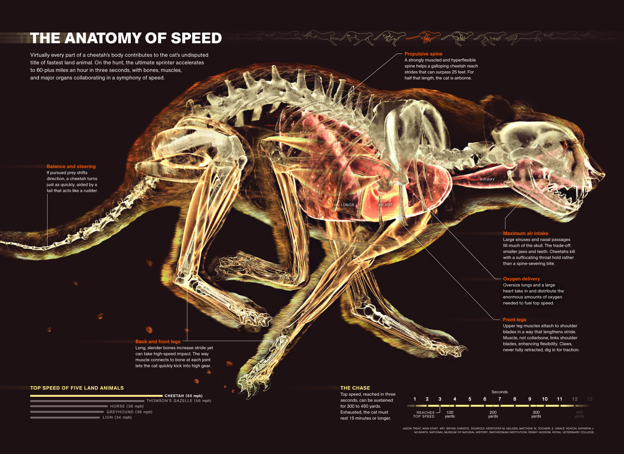
The Anatomy of Speed, by Jason Treat, Senior Graphics Editor, National Geographic & Bryan Christie, Bryan Christie Design
When researching the cheetah’s anatomy, Jason Treat was struck by how all of its features accommodate the animal’s need for speed. “The thing that really sealed it for me was the way that the lungs and the heart are enlarged—it’s like a jet engine,” he says. The resulting infographic depicts the animal like a machine built to sprint.
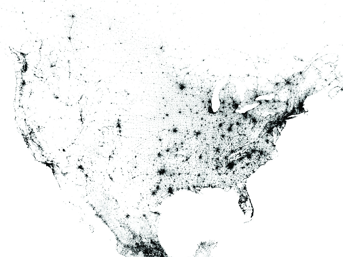
Census Dotmap, by Brandon Martin-Anderson, a researcher at the MIT Media Lab
After a cartographer told Brandon Martin-Anderson that it would be nearly impossible to depict the population of every named place in the U.S., he set out to do just that, and then some. Armed with 2010 U.S., 2011 Canadian, and 2010 Mexican census data and software he wrote himself, he built this map over a six-day period, approximately. From the start, Martin-Anderson wasn’t sure how the final image would turn out. “I don’t come up with what it should look like from the beginning,” he says, “It’s like throwing things on the canvas until you find something that works.” The 454,064,098 dots represent people—individuals in the case of the U.S. and Canada, and the smallest population unit available in Mexico.
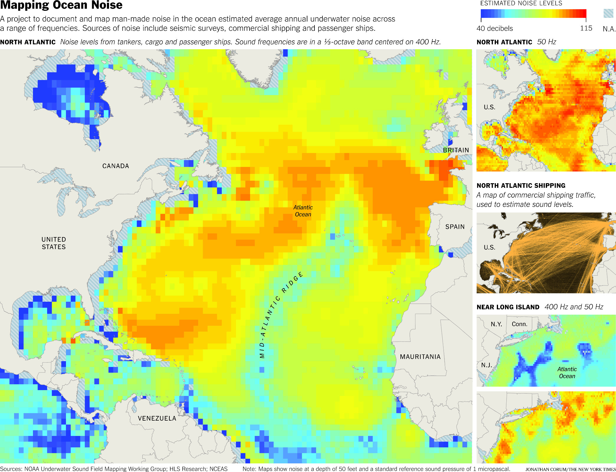
Mapping Ocean Noise, Jonathan Corum, Science Graphics Editor, New York Times
Infographics help spread the word to the public about scientific data and findings, says Jonathan Corum. “Scientific papers frequently use charts and graphics to communicate information,” he says, but “often those kinds of graphics need to be translated or redesigned for a general audience.” To create this image—which represents the average level of manmade noise in the North Atlantic—he rebuilt maps originally produced by the NOAA Underwater Sound Field Mapping Working Group.
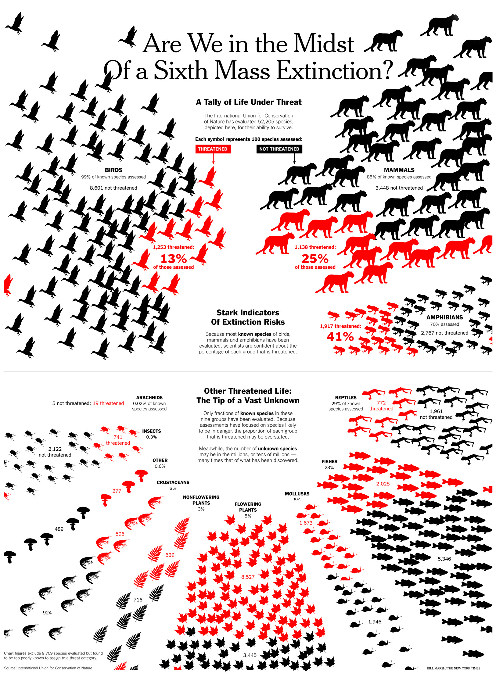
Are We in the Midst of a Sixth Mass Extinction? by Bill Marsh, Sunday Review Graphics Editor, New York Times
Bill Marsh’s black-and-red image depicts species at risk of extinction, based on data from the International Union for Conservation of Nature. When it comes to designing infographics, Marsh says there’s a dance between visual appeal and clarity of information. For example, he chose a big cat to represent all mammals because, “right away [they] convey that we’re talking about a certain type of animal, and big cats in particular are threatened.” To signify threatened flowering plants, he chose a maple leaf, because not all flowering species have the typical floral bloom. “We didn’t want to give people the wrong impression by literally selecting a flower image,” he says.
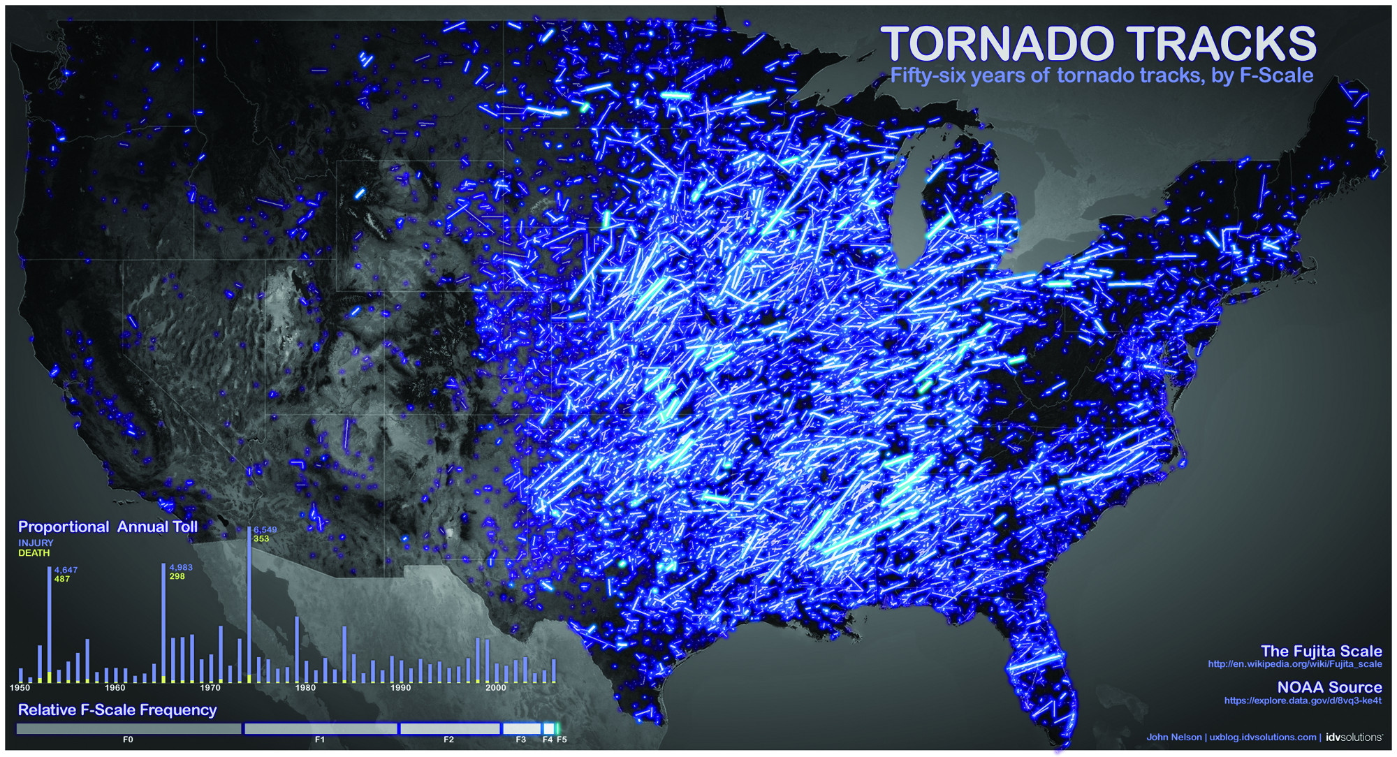
Tornado Tracks, by John Nelson, cartographer at IDV Solutions in Lansing, Michigan
A cartographer by trade, John Nelson finds maps to be a particularly effective way to communicate information. They’re “a special tool for presenting data, because they relate so intrinsically to our perception of reality,” he says. “We all understand the concept of ‘where,’ and so much data has a meaningful spatial dimension that it just begs to be mapped.” In this purple- and blue-streaked map, Nelson breaks down 56 years’ worth of data on tornado activity in the mainland U.S., culled from the National Oceanic and Atmospheric Administration (NOAA).
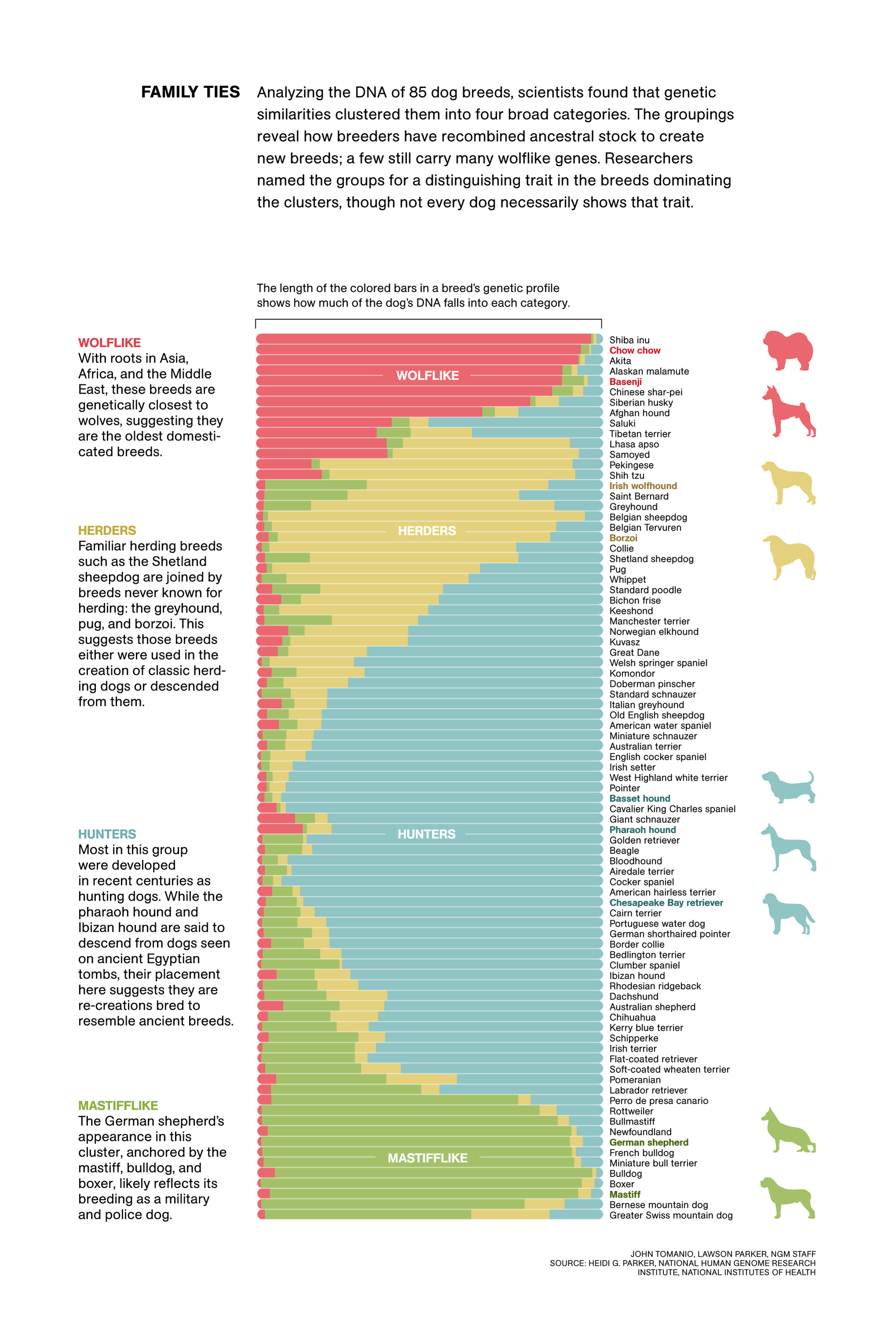
Family Ties, by John Tomanio, Senior Graphics Editor, National Geographic
John Tomanio chalks infographics’ popularity up to two things: First, good infographics help people quickly understand reams of data. Second, “I think geekiness is having its moment,” he says, “where some of the most highly visible people in our culture are involved in knowledge and data management”—such as Google and Facebook execs, as well as characters on shows like The Big Bang Theory. Here, Tomanio breaks down the 85 dog breeds into four broad genetic categories—wolflike, herders, hunters, and mastifflike.
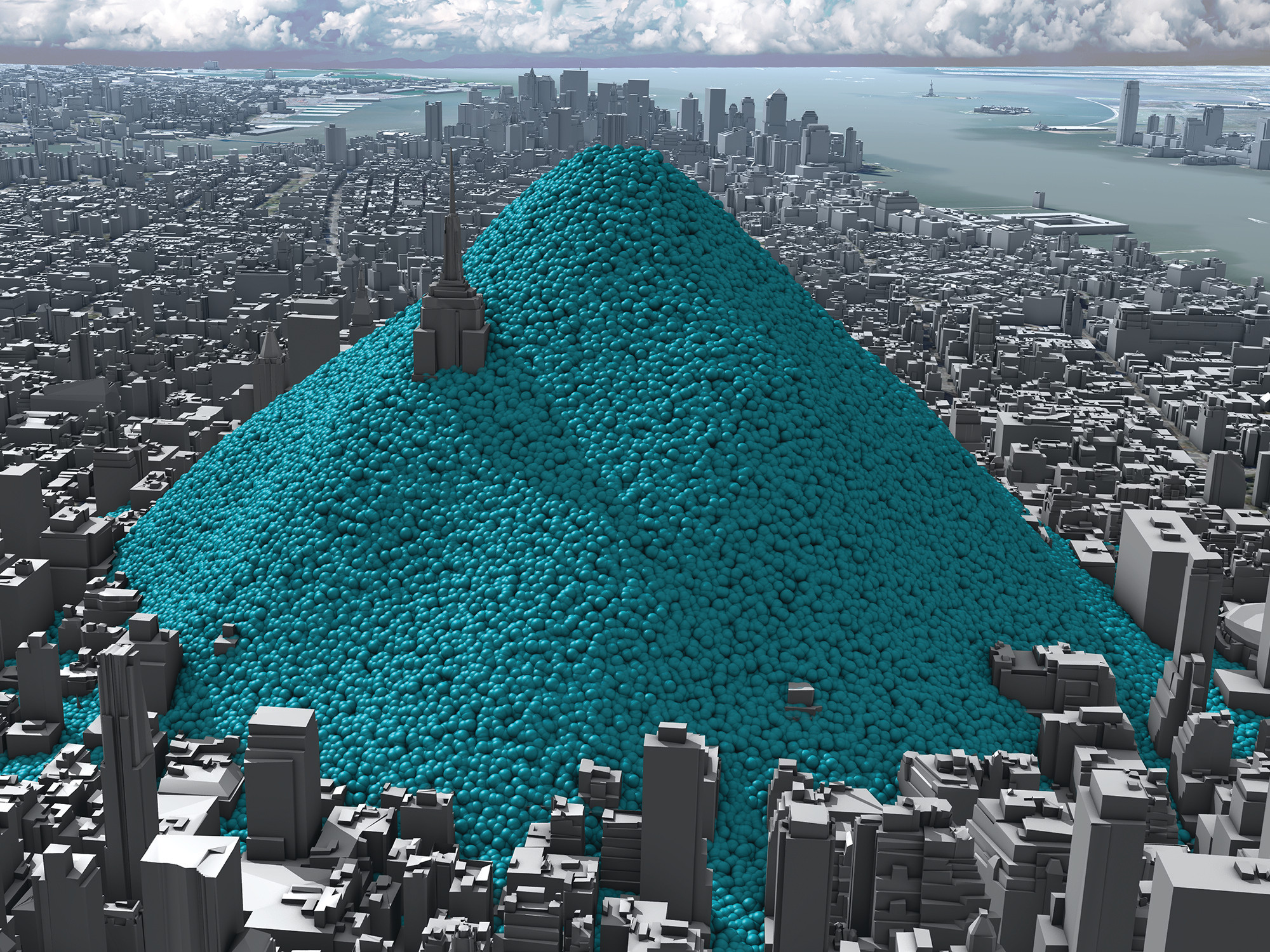
New York’s Carbon Emissions—in Real Time, by Adam Nieman, Creative Director, Carbon Visuals and Chris Rabet, freelance director and digital visual effects artist
This is a still from an infographic video that conceptualizes the 54 million metric tons of carbon dioxide that engulfed New York City in 2010. Designing the blue spheres—which each represent about a ton of CO2—took serious consideration. “We want the audience to focus on the rate that the spheres emerge and the size of the pile. We don’t want [people] to be distracted by questions such as, ‘Why are they moving like that?’” says Adam Nieman. “We put effort into making them move in a way that fits with viewers’ expectations of how slightly heavier-than-air gas might move.”
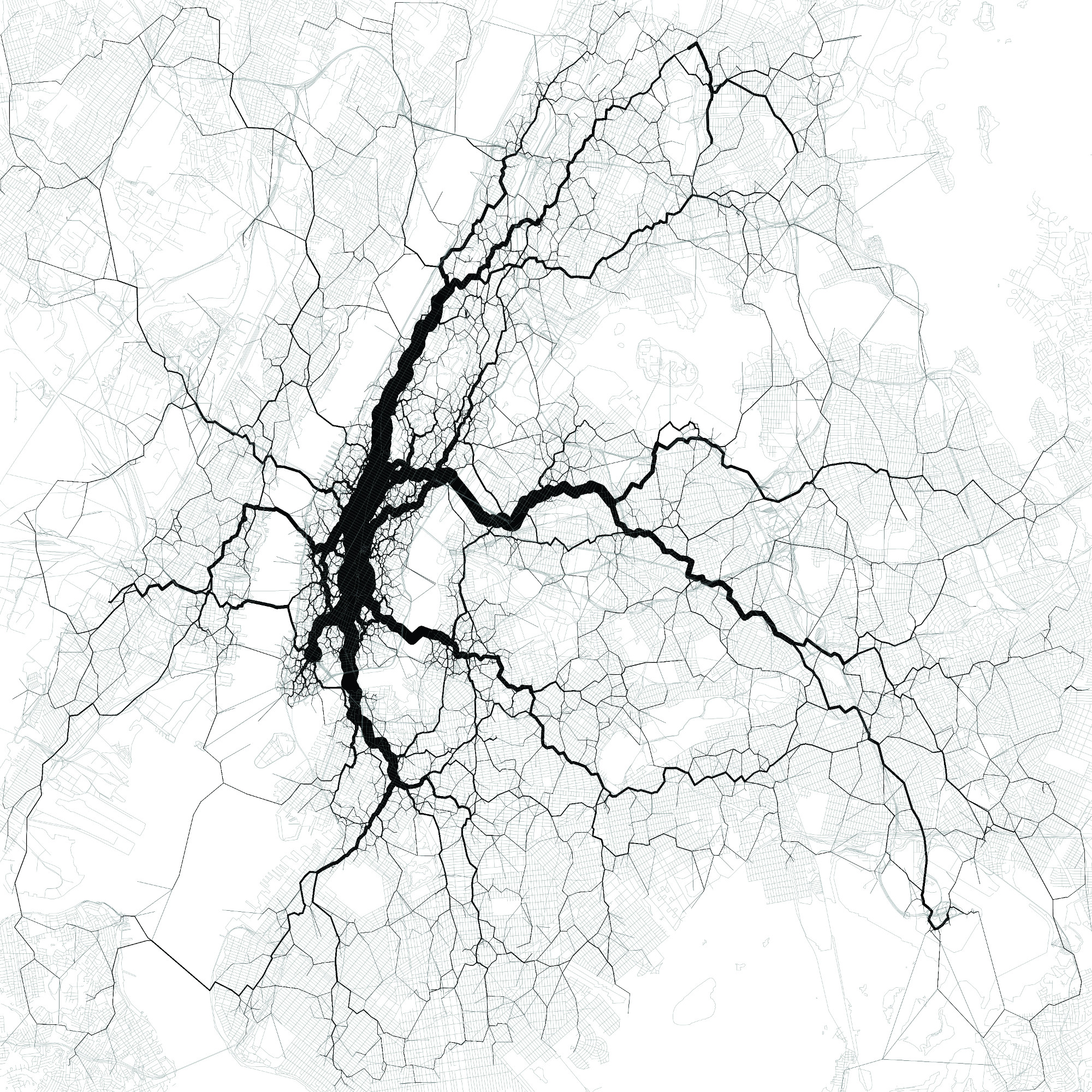
Paths Through New York City, by Eric Fischer, artist in residence at the Exploratorium in San Francisco
The vein-like threads in Eric Fischer’s map pulse with information conveyed through people’s tweets on Twitter, which is “the largest and most demographically representative source of public real time mobility data I know of, with over four million worldwide geotagged tweets a day,” says Fischer. He says this type of map could inform decisions on how to enhance subway systems by prompting questions such as, “‘What routes will satisfy the largest transportation needs and simultaneously bring those riders past the greatest number of intermediate destinations along the way?’ New York already has most of the subways it needs, but many other cities don’t.”
Becky Fogel is a newscast host and producer at Texas Standard, a daily news show broadcast by KUT in Austin, Texas. She was formerly Science Friday’s production assistant.