We Asked What Maps You Love. Here’s What You Showed Us.
Maps aren’t just for navigation. They’re also about stories, identity, and our connections to the world around us.
Andrew Middleton rankles at the idea that maps are becoming obsolete because we have tools like Google Maps or Waze. Maps have never just been for day-to-day navigation, he points out. Humans have been making maps for cosmology, religion, science, commerce, empire, propaganda, education, and more, for thousands of years.
The gas station road map? It showed up in a “blink of an eye of human history” to meet the needs of an American middle class that had gained access to automobiles, he says. But that’s just one application of maps, and there are a lot of other interesting things happening in the world of cartography today.
“This is a golden age of cartography,” says Middleton, a geographic information systems specialist and the owner of The Map Center in Pawtucket, Rhode Island. The center is focused on showcasing the work of living cartographers and providing a space where visitors can learn, have fun, and see the world through others’ eyes.
When someone is drawn to a particular map, “that means a connection to a place, a reminder of who they are as a human being, and identity.”
We asked our listeners and followers to share their favorite maps, and were delighted by the responses. Here are just a few of them. (Some responses have been edited for brevity and clarity.)
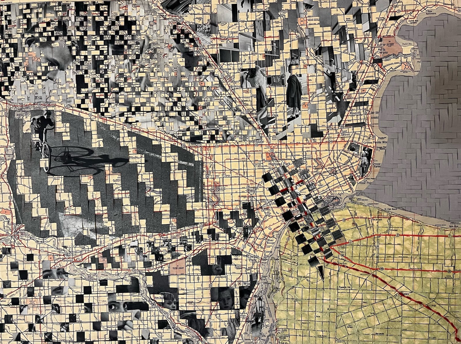
The paper map in “School House” was produced in 1954, the same year the US Supreme Court decided the landmark case Brown vs. Board of Education. This map was also produced before the passage of the Federal-Aid Highway Act of 1956 and the National Interstate and Defense Highways Act. Detroit’s population decline began in 1954 as a direct result of federal policies. White flight began and developed the suburbs. This artwork reflects the time period and allocation of resources to build new, yet separate, school districts.
Across working in all media, I continually return to the map, an object and concept that has fascinated me for most of my life. I have learned that the map is not the territory…territory changes. After 1954, the territory of cities and counties changed dramatically in Metro Detroit; the population has declined from 2 million to approximately 650,000 now. This woven work intersects the memory of physical space through illustrative cartography and images documenting significant relationships of time and place. Each sub-region is woven with a different image and a different woven structure. — Camille Ann Brewer from Detroit, MI
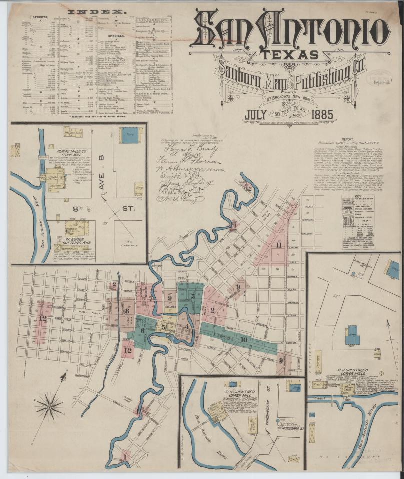
The Sanborn Maps, which were created for fire insurance purposes, provide valuable historical information about communities around the country. They allow you to go back and see how communities changed over time. Their accessibility makes them a useful resource for students, professionals and citizens. — David from Scituate, MA
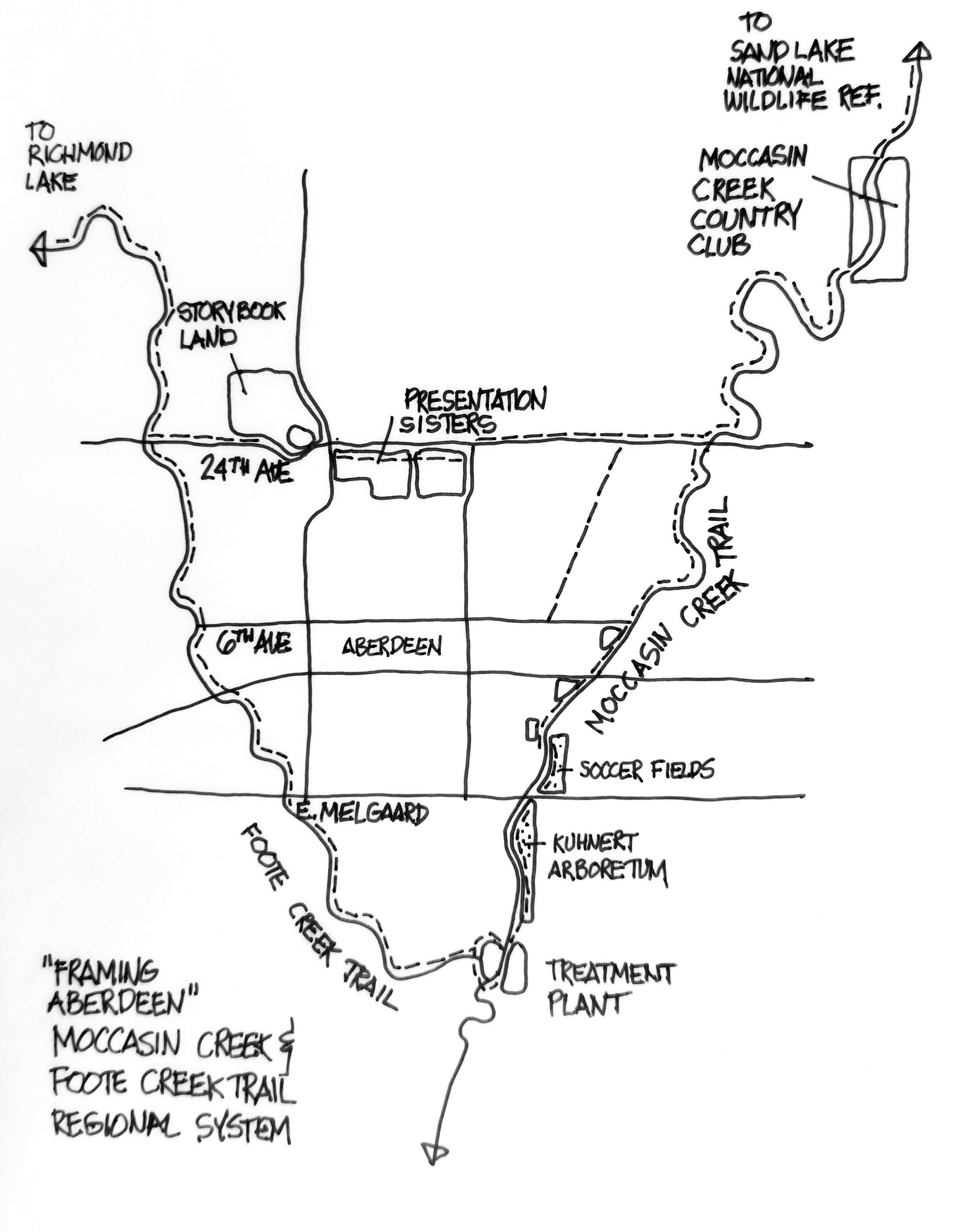
This is a hand-sketched map done on a napkin during a lunch while reading about a 1907 idea to view the creek systems of Aberdeen, South Dakota, as a park system. Foote Creek and Moccasin Creek frame the city of Aberdeen, but no map existed showing this idea. So we sketched a map on a napkin over lunch and now are discussing this idea with the city. The idea needed to be mapped and a napkin map can be just as important as a sophisticated computer-generated map if the idea is clear. It isn’t a Nolli map of Rome but it has communicated a great idea. — Phil from Chicago, IL
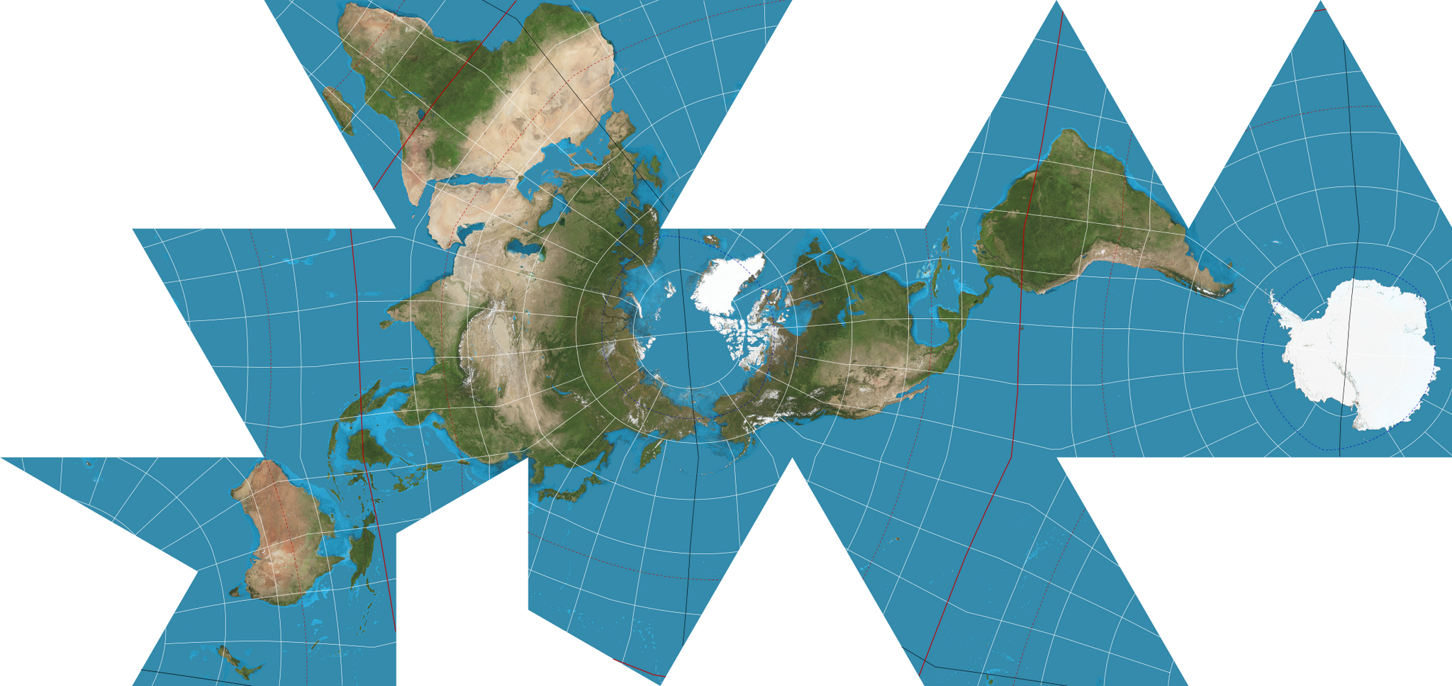
Several people mentioned the Dymaxion map, a projection developed by Buckminster Fuller, which shows the Earth’s continents with relatively little distortion of size and shape in relation to each other. “To me, it shows that we are all living on one big island,” says Brett from Cullman, AL.
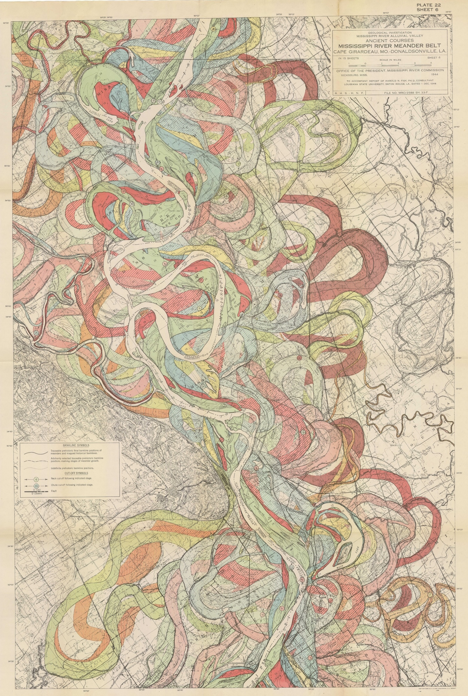
This series of maps caught my eye from one blog or another a few years ago and it came to mind immediately when you asked for a favorite. The maps show the location of the current and historic channel locations and elevators of the Mississippi River. They were made in the 1940’s by a cartographer named Harold Fisk working for the US Army Corps of engineers. I like them because they show a complex subject in all its detail using a color palette that aids in understanding. — Emil from Petersburg
As for Middleton, he can’t commit to one favorite, but he sure does like this hand-drawn map of Providence, Rhode Island, by his friend Matthew Shaffer, for its extreme detail and the way it riffs on the historic bird’s-eye view maps.
“It appears to be objective and precise and detailed,” he says, but a lot of aesthetic and value judgments go into such a work. “I think a lot of his heart and a lot of his ideas about what makes a city a good place to live are suffused throughout.”