Exploring The Grand Canyon, Through Maps
17:32 minutes
Later this month, the Grand Canyon celebrates the 100th anniversary of becoming a national park. But the natural wonder has way more than 100 years of stories to tell. The millions of years of geologic history, coupled with the massive scale of the canyon, make it challenging to create a comprehensive view of the Grand Canyon.
“It’s almost inconceivable,” says Matthew Toro, director of maps, imagery, and geospatial data for the Arizona State University Libraries. “Even if you’re on the rim, you can’t see the whole thing. The tools that allow us to see the canyon in its entirety are maps.”
Toro joins guest host John Dankosky to talk about a project to collect and organize maps of the iconic park to help tell its geologic and cultural stories. So far, they have over 300 maps in their collection, from sketches by early explorers and fur trappers, to automobile tourism maps from the 1950s.
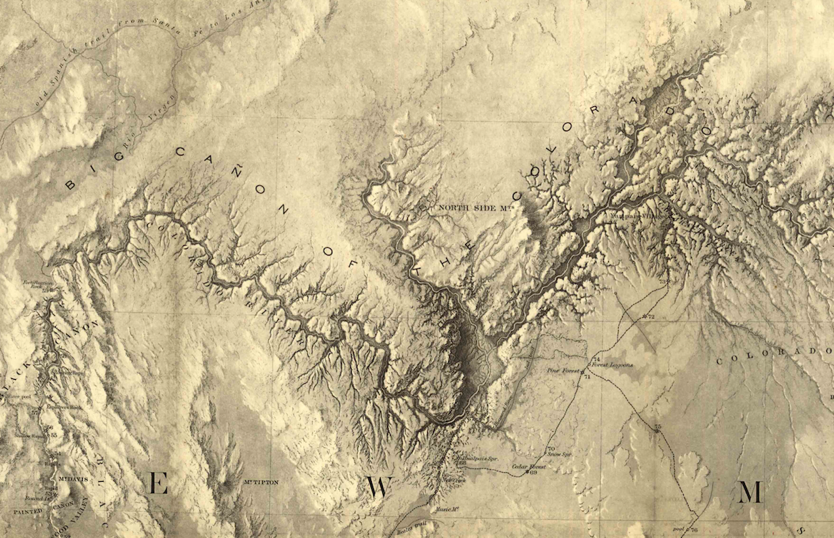
You can explore these maps up-close and in high resolution here.
Video produced by ASU Now.
Matthew Toro is the Director of Maps, Imagery, and Geospatial Services for ASU Libraries at the Arizona State University in Tempe, Arizona.
JOHN DANKOSKY: This is Science Friday. I’m John Dankosky. Later this month, the Grand Canyon marks its 100th anniversary as a national park. And if you’ve ever been there you know that it’s– well, it’s overwhelming. The canyon itself is over 270 miles long and the park area covers some 1.2 million acres. But there is a way people can get a larger perspective on the natural wonder and how it came to be with maps. Joining me now is Matthew Toro. He’s director of maps, imagery, and geospatial services at the ASU libraries, part of Arizona State University in Tempe, Arizona. He’s part of a team working to organize a comprehensive collection of maps dealing with the history, the geology, and the culture of the Grand Canyon. Matthew, welcome to the program. Thanks so much for being here.
MATTHEW TORO: Good afternoon. Thank you for having me, John.
JOHN DANKOSKY: And if you’ve got questions about the Grand Canyon and great maps of it, 844-724-8255 or 844-SCI-TALK. Well, let’s just start by talking with the maps in your collection. Give us some examples.
MATTHEW TORO: Sure. Well, we have a selection of maps covering all sorts of thematic mapping activities from topographic maps, geologic maps, fancifully illustrated pictorial maps– those are the sorts of maps with cartoonish caricatures and whatnot– all the way to more modern GIS data-driven maps showing subjects as diverse as death in the Grand Canyon and other various data that could be displayed geographically for that region.
JOHN DANKOSKY: So a whole bunch of different kinds of maps. Does your library own all these?
MATTHEW TORO: No, no, not at all. We’re actively trying to source all these sorts of maps, as you said, as comprehensively as possible from multiple libraries, including the Library of Congress, and other regional libraries here in the greater Southwest.
JOHN DANKOSKY: And you’re digitizing maps, so you’ve got them in digital form, you’ve got them on paper, all sorts of ways.
MATTHEW TORO: Yeah, so a big aspiration of this research project is to kind of collect and compile and categorize and make sense of the chronology of mapping activities of the region but also to take it a step further and georeference them and sort of add value to these, often paper-based, products. Digitize them, turn them into pixels on a screen, and then assign them coordinates, because they all correspond to the actual Grand Canyon. Assign them coordinates so that they can be used and interlaid with other data sets pertaining to the Grand Canyon.
JOHN DANKOSKY: What’s the oldest Grand Canyon map you have in this collection?
MATTHEW TORO: Well, it’s not a well-known map, but there is a fantastic map of the Northwest fir country published in 1836, or excuse me, compiled– drawn– in 1836 but not published for over a century. The actual publication– the book publication it was published in was from 1940, and it’s, by modern standards, an extremely crude map. As I said, it’s a map of the Northwest fir country. So one wouldn’t otherwise imagine that the Grand Canyon be included, but down on the southern tip of that map is a very crudely drawn depiction of what was then perceived as the Colorado River and a very crude depiction of two big barriers on each side of this Colorado River, suggesting and communicating to the map reader that you cannot cross here. And that’s a really fantastic one.
JOHN DANKOSKY: Basically, just you’re going to have to go around. This isn’t going to work.
MATTHEW TORO: And that’s the reality as it is today, too. I mean, those wishing to visit the Grand Canyon effectively have to drive all the way around it if they want to visit the north rim. So there’s the Navajo bridge up there, over towards Paige and northwestern Arizona. So if you want to visit the north rim of the Grand Canyon, which only 10% of Grand Canyon visitors actually do, you really still have to do it the same way they did centuries ago.
JOHN DANKOSKY: Only 10%? I mean, when you say something like that it makes me wonder just how much we actually know about the Grand Canyon. You can have hundreds and hundreds of maps, but how much do we really know about what it’s like in there?
MATTHEW TORO: And that’s what fascinates me most, John. So all of us talk about the Grand Canyon like it’s a matter of fact, but it really is an abstraction. And you know, we can talk about the Grand Canyon as some singular unified entity– large regional entity– but it’s really the work of maps that allow us to mentally abstract and make sense of this massive space, because when you’re in there– when you’re down in the depths of the Grand Canyon at the Colorado River– you’re minute. You’re a tiny little ant down there. And so few of us, even from the rims, the north rim or the south rim, or even if you get into the depths of the Grand Canyon, we see tiny fragments of it. And that’s not to mention that the vast, vast Western sections of the Grand Canyon that most humans have never even seen.
JOHN DANKOSKY: There’s such a difference between what we can do now– take digital photos or take satellite imagery and piece something together. We may still not know what it really looks like down in there, but we have a pretty good sense. How are they making these maps hundreds of years ago? How are they figuring out what the Grand Canyon looked like, and writing it down, and having it be something that somewhat resembles reality?
MATTHEW TORO: Absolutely. That’s what I respect most. I mean, we’re talking about the middle of the 19th century. Some of the earliest explorers, Joseph Christmas Ives and his crew that started up the Colorado River by steamboat and then switched to an overland exploration of the Grand Canyon– they produced some fantastic maps and really gorgeous. But they were speculating on what the actual course of the Colorado River looked like. Jump about 10 or 11 years later to John Wesley Powell’s famous 1869 first exploration through the entire course of the Colorado River. And that really started the era of modern mapping, and back then, they were using theodolites and barometers to measure altitude and chronometers to determine latitude and longitude.
And really, the same kind of mathematic principles that they were using back 150 years ago, even the most modern satellites and our global positioning systems still fundamentally use the same principles of trigonometry. Trilateration, effectively determining measuring triangles and being able to create entire control survey control networks and to determine the locations of things. And then, we have this entire legacy of building upon the sort of topographic base map with other kind of value-added bits of data. So geologic data and all the other types of data could be collected for the Grand Canyon from cultural resources, archeological resources, et cetera, to land use, land cover patterns, vegetation distributions, et cetera.
JOHN DANKOSKY: If you want to join our conversation, you’ve got a question about maps or the Grand Canyon– maybe you’ve been there and you understand just how vast it is, how maps could help, 844-724-8255 or 844-SCI-TALK, as we talk with Matthew Toro, director of maps at ASU libraries.
I want to go back to that 1858 map you talked about. Joseph Christmas Ives, they started on a steamboat up the river, and then they just went as far as what, and then what did they do?
MATTHEW TORO: And that’s right. So you have to remember, this is right before the Civil War, the American Civil War. So it was actually a fantastic map that they ultimately produced. Yeah, they took their steamboat as far up the Colorado River as they could, until it was no longer any deemed navigable. They got off their steamboat, called the explorer, and then it was a massive overland trek. And up there on the southern rim are the southern plateaus, if you will, on the south side of the Colorado River. We’re talking about traversing hundreds of miles of landscape.
And one of the artists and cartographers they had onboard was a gentleman by the name of Egloffstein, and he’s kind of a renowned cartographer, because he was one of the first to introduce hill shading techniques in his depiction of three-dimensional landscapes of topography effectively. And so there’s so many sorts of considerations to be made, not only aesthetic and representational, but also data-driven. So first, how do you get the raw data? And then, how do you actually go about depicting it and communicating what is there to the consumers, the map readers? So yeah, overland trek and they didn’t make it all the way through.
So if you look at those 1858 maps, you see– I mean, these are some of the most gorgeous maps of the Grand Canyon you can find but they’re so grossly incorrect. So I mean, for a large section of the Colorado River, it’s purely speculative but it looks– it’s so well done. It’s so beautifully done that it looks authoritative, and that’s another side of this.
Maps carry a certain authority, partly because of the history of map making. It’s often a government based enterprise. We’re seeing a transformation in mapping technologies, et cetera, that’s sort of democratizing and bringing the power of cartography to individuals rather than large nation states or other sorts of powerful political economic actors. But because of that, because of the authority maps convey, people view them as factual even though they can sometimes be grossly inaccurate.
JOHN DANKOSKY: Well, and I want to ask you about that. I do want to tell our listeners that if you want to take a look at some of these maps we’re talking about, sciencefriday.com/maps. And there’s so much interesting stuff in there. What is the value of the map that has a gross misrepresentation or, sort of, some version of “here be dragons,” right? We don’t really know what’s there. But we’re just going to put something on the map, anyway. What’s the real value, historically, of that?
MATTHEW TORO: Well, you know, there’s an entire legacy here. In this era, especially for the Grand Canyon, we’re talking about an era where this region of northwestern Arizona was depicted on maps as this conspicuous blank space, because all the official government maps only wanted to portray the most reliable data. And the fact of the matter was that there was no reliable topographic data of what was there or hydrographic data. What was the course of the river?
So yeah, one could argue, well, these things are worthless. But with every iteration, with every, sort of, generation of these kind of pioneering topographic surveys, they incrementally built their knowledge of what, indeed, was there. And like I was saying earlier, it was really John Wesley Powell’s initial 1869 and subsequent 1871 and ’72 exploration of the Colorado River that firstly, most importantly, corrected the course of the Colorado River.
And it also coincided, not coincidentally, with the development or the creation of the United States Geological Survey, which, of course, is the United States’ mapping agency. So here we have the predecessor, and this was one of four large Western surveys that were ultimately assembled and compiled to create the United States Geological Survey. So maybe one could argue, yeah, these maps are effectively worthless. But for the explorers and the frontierspeople of the time, any sort of geographic knowledge is better than none, right?
JOHN DANKOSKY: Well, absolutely. We’ve got some calls coming in, too. Gary is in Salt Lake City, Utah, not that terribly far from the canyon. Hi there, Gary. You’re on Science Friday.
GARY: Hello. I had a question about raised relief maps. I own a few, and normally they protrude out, you know, 3D out of the map. How would they make one to go in with the canyon, and also, how do they make them? How do they even make these maps?
JOHN DANKOSKY: That’s a great question. Matthew?
MATTHEW TORO: Sure. Yeah, I can give some basics. I’m no expert on raised relief maps, but it’s effectively taking the raw topographic data. So these raised relief maps often are reproductions of United States Geological Survey, a topographic map series, and those come in multiple scales. The most common scales are currently the 1 to 24,000 series, but there’s also the 1 to 62,500 series, which are approximately 15 minutes latitude by 15 minute longitude. And so they basically take these series of USGS-based maps, and they warp them and reproduce them, effectively, in plastic.
And so I’m more familiar with the more digital processes. I’m not familiar with the specific processes involved with the plastic raised relief maps, which are fantastic. I love them, and I have several of them myself. But yes, so it’s effectively taking those values of elevation– these days, in the modern era, we have what’s called a DEM or a digital elevation model– so this is effectively a series of pixels where each pixel has a value of elevation, and with a few tricks of a GIS, a geographic information system software, you basically extrude those values of elevation.
So getting back to the more traditional raised relief plastic maps, you’re basically taking topographic data, which is typically represented by isometric contour lines– when the control lines are closer together, that’s indicating that there’s a very steep relief, right? And when they’re farther apart, that’s communicating that it’s relatively a flat slope. And so taking those, and again, this is the real point. This is my interest here. All of that is data that is actually encapsulated, embodied either on a piece of paper, or on a plastic raised relief map, or in some sort of database, and effectively taking those data and again, I don’t know the process for the raised relief maps, but taking those data and extruding them. So digital methods are different these days. But that’s the fundamental process.
JOHN DANKOSKY: I’m John Dankosky, and this is Science Friday from WNYC Studios. And we’re talking about maps and mapping the Grand Canyon. I should ask, there were people obviously living around the Grand Canyon region long before Europeans saw it. Did they have any maps that you’ve found?
MATTHEW TORO: That’s a great question, and I get asked it a lot, especially– the initial impetus for this project was a fantastic grant that myself and a small research team that I assembled, one through the Arizona State University Institute for Humanities Research. And so, yeah, from a humanities perspective, we need to be cognizant and sensitive to those who preceded the Anglo or white European centric views of mapping space. So I get asked this question a lot. And unfortunately, I always have to respond with, no, to our knowledge, there are no extant Native American representations of space the way we modern Americans or modern Westerners think of depictions of space.
There’s many reasons for this. I’m no expert with indigenous mappings. But I mean, the simplest of course, is that for people living in the area, some sort of top-down allocentric– here’s the view of space from a bird’s-eye view– that wasn’t really needed for people who intimately know landmarks and landscapes and intimately know the course of the river. There’s no real need to colonize or imperialize and depict this space for effectively controlling it. And that’s, unfortunately and realistically, for long sections of history, why maps were produced, you know, for controlling space.
JOHN DANKOSKY: We got a tweet from Michael, who asks, what is the least map-like map in your collection?
MATTHEW TORO: Huh. That’s a fascinating question. The least map-like map. I guess it depends on how you define what a map is, but–
JOHN DANKOSKY: Yeah, I’d say a map is something I can use to plot my course. You know, I want to make sure I get the right place in the right time. But I’m quite sure there are some in your collection that are a bit more cartoony, a little less specific.
MATTHEW TORO: Absolutely. Absolutely yes. So modern humans, we often think of the map as what we carry around on our smartphone that’s used primarily for navigation. But yes, some of the most fantastical maps, if you will, are some of those cartoonish pictorial maps and those– there’s a whole kind of era of mostly automobile and gasoline company maps that were produced to effectively promote automobile tourism. You know, you have a rising middle class. This is a couple of decades after the sort of Fortis model of growing the middle class, and more people are owning automobiles. More people have disposable income, and the United States has recently grown.
So we’re talking about the 1920s to the 1950s and a lot of these mass-produced by AAA, or automobile companies, or petroleum gasoline companies are producing these maps encouraging people to go out and drive. And on these maps are fanciful cartoons of the various sorts of characters and scenes that you can find, and they’re fantastic to look at– really interesting maps– and maybe not the best for navigation, but definitely interesting for delving into the very stories of these places.
JOHN DANKOSKY: You mentioned the fanciful depictions. We’ve been having this discussion online and also in the Science Friday Studios here. Are maps art to you? Because I look at them, and I see something that’s fantastically beautiful. But some people just say, well, it’s a tool. It’s not really art.
MATTHEW TORO: No, I would, without question, say maps are art, and I think that’s why people universally love maps. One need not be a geographer, or an applied cartographer, or one of the other usual suspects of map makers or map consumers, you know, geologists, architects, et cetera, to love maps, and I think the reason we do love them is because they are art. In my home– I’ve recently visited the Miami International Map Fair in Miami, Florida. And it’s this giant map fair, and people are buying maps, and often they’re putting them in their home as decoration, because that’s what they are.
JOHN DANKOSKY: Well, we’ve got to leave now, but Matthew Toro, director of maps at ASU libraries, thank you so much. If you want to see some of these MAPS, visit sciencefriday.com/maps.
Copyright © 2019 Science Friday Initiative. All rights reserved. Science Friday transcripts are produced on a tight deadline by 3Play Media. Fidelity to the original aired/published audio or video file might vary, and text might be updated or amended in the future. For the authoritative record of Science Friday’s programming, please visit the original aired/published recording. For terms of use and more information, visit our policies pages at http://www.sciencefriday.com/about/policies/
As Science Friday’s director and senior producer, Charles Bergquist channels the chaos of a live production studio into something sounding like a radio program. Favorite topics include planetary sciences, chemistry, materials, and shiny things with blinking lights.
John Dankosky works with the radio team to create our weekly show, and is helping to build our State of Science Reporting Network. He’s also been a long-time guest host on Science Friday. He and his wife have three cats, thousands of bees, and a yoga studio in the sleepy Northwest hills of Connecticut.