Subscribe to Science Friday
It’s easy to take maps for granted. After all, most of us have a pretty good map in our pockets at all times, ready to show us how to get anywhere on the globe. But to make a map useful, you have to decide what to keep in and what to leave out—and, most importantly, which mathematical equations to use. Beyond navigating from point A to point B, math and maps come together for a wide variety of things, like working out the most efficient route to deliver packages, calculating the depth of the ocean floor, and more.
Host Ira Flatow is joined by Paulina Rowińska, mathematician and author of Mapmatics: A Mathematician’s Guide to Navigating the World, to go on a journey through the math at the heart of all kinds of maps.
Read an excerpt of Mapmatics: A Mathematician’s Guide to Navigating the World.
We Asked What Maps You Love. Here’s What You Showed Us.
Maps aren’t just for navigation. They’re also about stories, identity, and our connections to the world around us. We asked our listeners and followers to share their favorite maps, and were delighted by the responses. Here are just a few of them.
Segment Guests
Paulina Rowińska
Dr. Paulina Rowińska is a mathematician, writer, science journalist and author of Mapmatics: A Mathematician’s Guide to Navigating the World.
Segment Transcript
IRA FLATOW: Hi, this is Ira Flatow, and you’re listening to Science Friday.
[MUSIC PLAYING]
Today on the show, understanding the math used to make maps.
PAULINA ROWINSKA: Every single map we create is distorted in some way. It’s not a perfect representation of the Earth.
IRA FLATOW: Your common everyday map can be quite confusing and, well, just inaccurate. Greenland, for example, is shown to be about the same size as South America when, in fact, South America is really eight times larger. Then again, most of us take for granted how maps are designed. After all, we’ve got a pretty good map in our pockets at all times ready to show us turn-by-turn directions to get anywhere on the globe.
But to make a map useful, you have to decide what to leave out and what to and, most importantly, which mathematical equations to use. And beyond navigating from point A to point B, maps are used for a wide variety of things, like the most efficient route to deliver a package, calculating the depth of the ocean floor, and understanding the drawbacks of the Mercator projection.
Joining me now to take us on a journey through the math fundamental to all kinds of maps is my guest, Dr. Paulina Rowinska, mathematician, writer, science journalist, and author of the book Mapmatics– How We Navigate the World Through Numbers. She’s based in New York City. Paulina, welcome to Science Friday.
PAULINA ROWINSKA: Hello. Thank you for the invitation.
IRA FLATOW: You’re welcome. Can I begin with my pet peeve about how you get into trouble turning a three-dimensional thing like the Earth into a two-dimensional image, a map, and this Mercator projection? Tell me how all this happened.
PAULINA ROWINSKA: Yeah, so I think about making maps a bit like peeling an orange. An orange is round. When you peel it, you might want to, if you’re a mathematician, squash it on a flat table, but you cannot do it without tearing the orange, and that’s because of its curvature. And that the same happens with making maps.
So we are turning a curved sphere– the Earth is pretty much a sphere– onto a flat sheet of paper, and a gentleman named Gauss in the 19th century– he proved that this is actually impossible mathematically. When you have two surfaces of different curvatures, you cannot translate it like that without any distortions.
Well, we still do it. We still create maps. So what does it mean? This means exactly that every single map we create is distorted in some way. It’s not a perfect representation of the Earth. So one of the probably most famous world maps out there is Mercator projection.
It’s a very old projection. It’s a type of a map that protects the shapes, so the angles and the shapes of continents and countries, et cetera, but it distorts their sizes. So as we heard a couple of minutes ago, when we look at this map, Greenland looks massive. Africa looks tiny. And this is just a mathematical property of this map, and it’s just one of the many projections we can make.
IRA FLATOW: So this was basically created for sailors needing to get around the world?
PAULINA ROWINSKA: That’s correct, yes. Mercator created this map for a particular purpose. So the purpose of this map was to go on the sea and not get lost. And here’s where the angles come in. So back in the day, sailors were navigating with a compass and other equipment that required angles, and when you are in the middle of the sea, your main concern is to figure out which direction to go to. Yes, it would be nice to how long it’s going to take, but that’s a secondary problem because if you go in the wrong direction, you won’t get there at all.
So that’s why Mercator’s map was so useful, and we still use it for navigation, versions of Mercator map, not exactly the same map as the centuries-old map, but versions of it are on Google Maps and other online maps. So this map was made for navigation.
IRA FLATOW: Yeah, so it gets so it gets the job done in that sense.
PAULINA ROWINSKA: It does. It does, yes.
IRA FLATOW: Now, I understand you are a mathematician. How did you get into maps? Was this a hobby or something?
PAULINA ROWINSKA: Yeah, so I was a bit of a geography nerd at school.
[LAUGHTER]
I really loved maps and geography. I did even geography olympiads or whatever we call it.
IRA FLATOW: Very nerdy, yes.
PAULINA ROWINSKA: Yes, very much. I definitely even as a kid loved my little globe and the maps we had at home, and I was just planning where I want to go and what I want to see and how these maps work. And then I went on to study mathematics and kind of forgot about this hobby for a bit.
And then when I started getting really into science communication and thinking about how to talk about mathematics and what’s really cool about mathematics, I kind of remembered about maps, and I started thinking about all these other mathematical properties of maps that we just don’t really consider every day– I personally don’t consider– and forget about them sometimes. And that’s how Mapmatics was born.
IRA FLATOW: Well, I’m trying to think of these other things that you just mentioned that you would not normally think about. Name a few of those things.
PAULINA ROWINSKA: Yeah, so one of the things that we tend to forget, even though most of us are aware of it, is when you live in a city and you go on a subway and you look at the map, it’s really easy to forget that this map doesn’t care about distances at all. It only shows us different lines and the order of stations on the line.
And this is really, really useful for us passengers because we decide which line to take, which stop, how to get from A to B. But if we use this map, which happened to me in the past, I must admit– when we use this map to walk, for example, or to plan travel time, it might turn out that even though on map a distance from A to B and B to C, they look the same, one takes five minutes to walk, and another one takes one hour to walk. And the map just uses space efficiently. It doesn’t care about that. So it’s something that maybe we’re aware of but sometimes it’s easy to forget, that this map does not represent reality at all.
IRA FLATOW: Yeah, I’ve been in a lot of cities with subway maps. I ride the subway almost every week in New York. And then you know what happens? When I get out of the subway station and go on the street, I take out another map, which is on my phone. How has the phone map changed the way we live?
PAULINA ROWINSKA: First of all, we are not carrying around paper maps, which I find a bit sad, but OK. Technology is sometimes more useful. But I feel we don’t think about where we are going, about how we navigate, about directions. I actually really loved writing about neuroscience of navigation when I was researching this book, which was a topic completely new for me, and there’s a lot of research on how we are just worse at navigating right now just because we are so used to just clicking a few buttons and following the route.
IRA FLATOW: Right. I remember cleaning out my garage and finding some really old maps, car driving maps, and opening them up and just forgetting how wonderful it is to see the giant expanse of where I’m going.
PAULINA ROWINSKA: It is, yes. In fact, well, when I first moved to London, which was almost 10 years ago at this point, I was the weirdo cycling around with a paper map because there is something about the physical map that just brings me so much joy. And I feel like I got to know the city way better this way.
[MUSIC PLAYING]
IRA FLATOW: After the break, the secret math used to deliver packages to your door.
PAULINA ROWINSKA: These are millions and millions of dollars behind these numbers and algorithms.
[MUSIC PLAYING]
IRA FLATOW: Let’s zoom out to the coastline. There are so many coastlines around the Earth. We live in a watery planet. Why is it so hard to measure a coastline? It seems like with satellite technology, we should have been able to master this challenge, no?
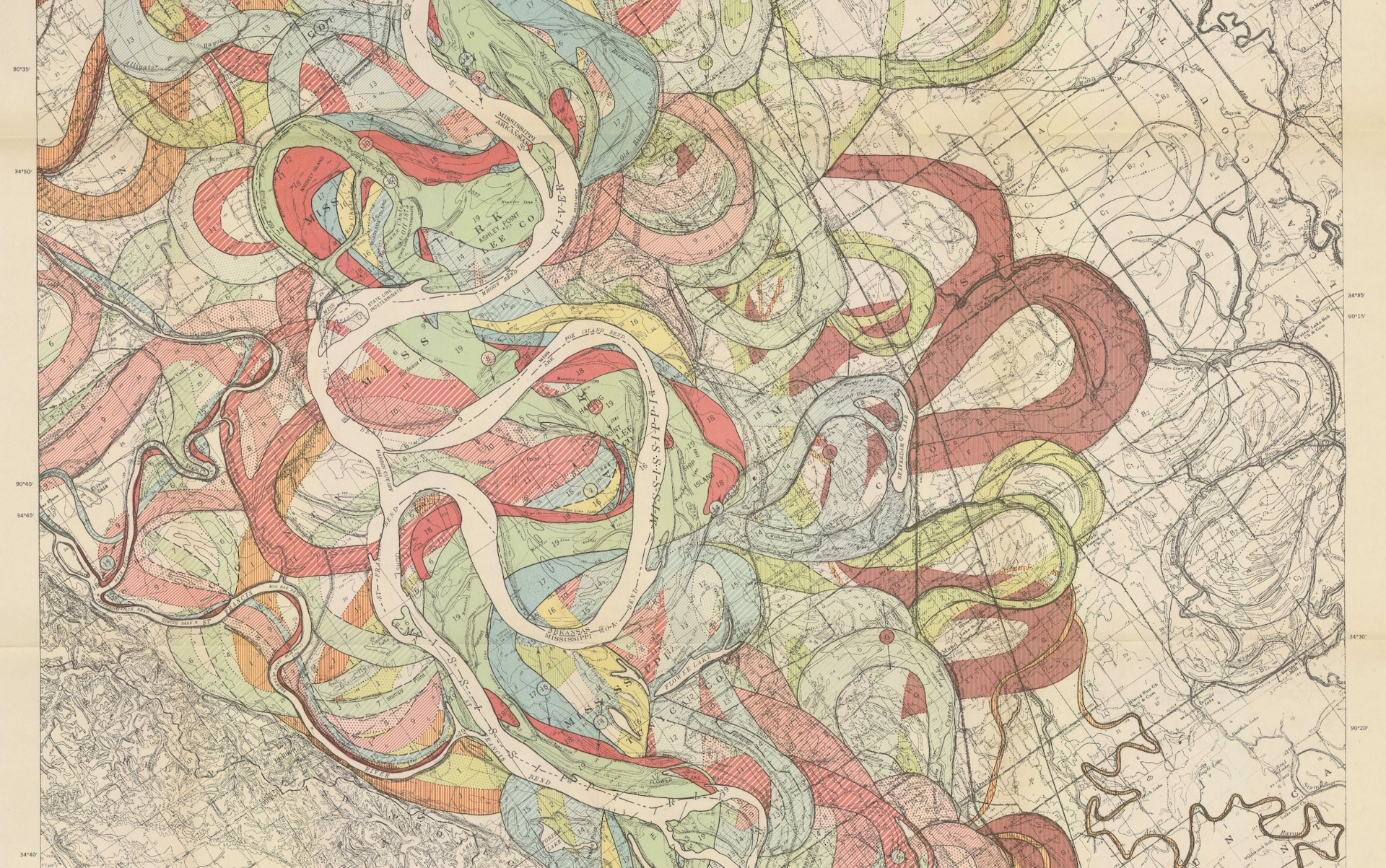
PAULINA ROWINSKA: Yes, everything will be nice and well if coastlines were like smooth lines, but they are not, especially in places like Norway, for example, with all these fjords or Alaska. So it depends on the scale of the map we are using because if you think about this, the map of the same exact place but on a larger scale and on a smaller scale, the one on the larger scale will show much more detail, will show all the nooks and crannies, all the little inlets and peninsula, while the other one just will miss it.
So you’ll see a smooth line where there should be many different lines, and because of that, so the more zoomed in we are, the longer the coastline seems to be. So we can compare the lengths of coastlines if they are all on the same scale, but it’s hard to tell exactly what the length is. I can measure it on one map. You can measure it on a different map, and we’ll find different answers.
IRA FLATOW: Right. I see what you’re talking about. And speaking of the coastline, you can’t think about the coast– at least I can’t– without thinking about the ocean underneath. And one of the most fascinating and unknown place is the ocean floor. Why is that so much more challenging than mapping the land? Can’t we just send down bots or something to map the ocean floor?
PAULINA ROWINSKA: I think we might get there one day, but it’s still– the ocean is vast. I think we tend to forget how big it is. And it’s hard to access. Now, when it comes to the ocean, first of all, we have to actually get out there and do some measurements, and also, when it comes to satellites, the bottom of the ocean is covered by water, surprisingly.
So you still can get some good information, but it’s not as detailed as we would want it to be. So yes, you will catch underwater mountains and this kind of stuff but will miss the small things. And it’s really important to know them, especially as we are developing, for example, wind farms and thinking about protecting the oceans.
And actually, up to the middle of the last century, we had no idea that there is something at the bottom of the ocean. People always thought that it’s just flat. There’s a 2030 project to map the bottom of the ocean. I don’t think we are getting there, although we are making some great progress.
IRA FLATOW: You reminded me just now of the first experience as a student I remember where maps were combined with mathematics, and that was what we used to call the traveling salesman problem. What is the most efficient way you can go to, like, five cities without hitting them twice? Is that kind of stuff still in use?
PAULINA ROWINSKA: Oh, yes. Have you recently ordered a package?
IRA FLATOW: Oh, who hasn’t?
PAULINA ROWINSKA: Exactly. And I think it’s a little miracle that these packages actually arrived to our door because think about it, the logistics of huge delivery companies to make sure that all the packages arrive to the recipients in as efficient time as possible. It’s insanely difficult, and it’s exactly traveling salesman problem for each of the delivery drivers.
The thing is that it changes every single day because it’s not that all the same people are ordering packages every day to the same destinations. And if you’ve ever seen a delivery driver, they are proceeding really fast. They have no time to waste. So every minute matters, so that’s why companies like FedEx, like UPS– their success depends on the algorithms they use because the less time they waste, the more packages they can deliver and the faster they can deliver them.
So all of them have many mathematicians and scientists taking a map and working out how to schedule the drivers, how to plan their routes, and how to do it fast. And it’s a very mathematically complicated problem, and it’s impossible to solve. We cannot find the best route. We have to find a route that’s good enough. And because of that, all these results are top secret. It’s impossible to find out.
IRA FLATOW: Oh, is that right?
PAULINA ROWINSKA: Yeah, I was trying to. There are some papers out there. But I didn’t manage to– I managed to piece something together, but it makes sense.
IRA FLATOW: Yeah, it’s a trade secret.
PAULINA ROWINSKA: Yeah, these are millions and millions of dollars behind these numbers and algorithms.
IRA FLATOW: Yeah. Now that you’ve written so much about maps, are there any maps that drive you nuts when you see them, ones that are particularly poorly designed?
PAULINA ROWINSKA: Yeah, so a general category of these maps is if there’s too much on the map. I want a map to show me one thing and not try to show every single thing. But also, there are some maps– especially I see them around elections or whenever we are showing some kind of data on a map that they really misrepresent the numbers.
So when you think about, for example, election maps, we often see the map– each state is either red or blue. The thing is that this really suggests that the area of a state, how big the state is is the same thing as how many people voted for the candidate. And I’d rather see these maps to be designed in a way that the number of votes is proportional to the area, so kind of like a skewed geographical map. So that’s not the only map that annoys me.
IRA FLATOW: Well, do you have one that’s favorite, that you really like?
PAULINA ROWINSKA: Do I have a favorite map? Honestly, I come back to the very old map of– this is a famous National Geographic world map that shows also the geography of the bottom of the oceans. And I find it– it’s beautiful. It was actually– there’s fantastic science behind it and great artists behind it. And it’s just– every time I look at this map, it reminds me why maps are worth looking at and using. And I don’t want them to be fully replaced with online maps that are useful but not as pretty. Let’s face it.
IRA FLATOW: Yeah. Is that the one where they’ve taken the water away and you can see the bottom?
PAULINA ROWINSKA: Yes.
IRA FLATOW: I love that map too.
PAULINA ROWINSKA: That’s exactly the one. Yeah, it’s beautiful.
IRA FLATOW: Well, thank you so much for taking the time to be with us today, and thank you for the book. It’s a terrific book.
PAULINA ROWINSKA: Thank you so much for having me, and I always love to speak about maps and math. So anytime.
IRA FLATOW: Yeah. I think you can tell I do also. So good luck to you, Dr. Paulina Rowinska, mathematician, writer, science journalist, and author of the book Mapmatics– How We Navigate the World Through Numbers. She’s based in New York City.
And is there a map that you love, professional, homemade, beautiful, bizarre? We want to about the maps that make you see the world in a new way, or they just make you smile. So please share your favorite map with us. Go to sciencefriday.com/maps, sciencefriday.com/maps.
[MUSIC PLAYING]
This episode was produced by Shoshannah Buxbaum. I’m Ira Flatow. Thanks for listening.
Copyright © 2025 Science Friday Initiative. All rights reserved. Science Friday transcripts are produced on a tight deadline by 3Play Media. Fidelity to the original aired/published audio or video file might vary, and text might be updated or amended in the future. For the authoritative record of Science Friday’s programming, please visit the original aired/published recording. For terms of use and more information, visit our policies pages at http://www.sciencefriday.com/about/policies/
Meet the Producers and Host
About Shoshannah Buxbaum
Shoshannah Buxbaum is a producer for Science Friday. She’s particularly drawn to stories about health, psychology, and the environment. She’s a proud New Jersey native and will happily share her opinions on why the state is deserving of a little more love.
About Ira Flatow
Ira Flatow is the founder and host of Science Friday. His green thumb has revived many an office plant at death’s door.