Grade Level
6 - 8
minutes
1- 2 hrs
Activity Type:
climate change, data communication, graphing, STEAM, sciart
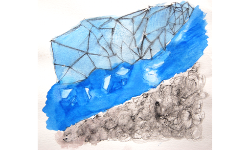
Do you see it? The line graph, in the artwork above?
Take another look. Whoa, right?
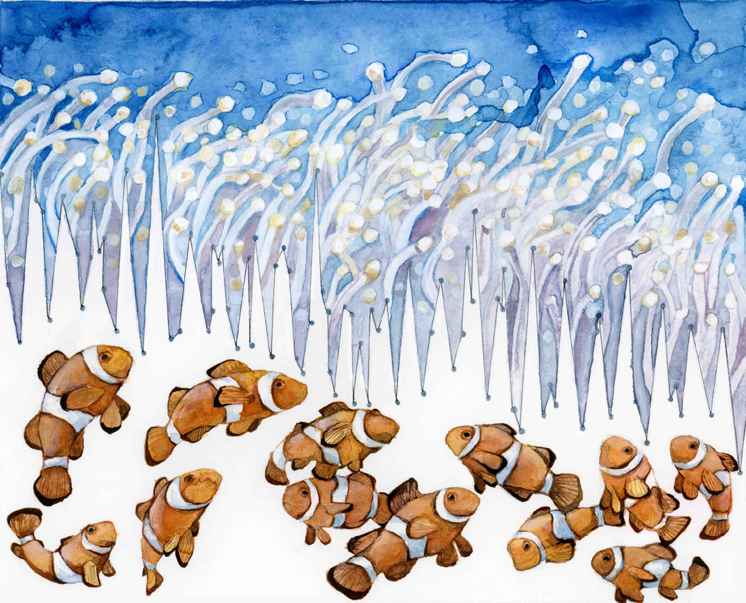
Artist and scientist Jill Pelto combines art with scientific data to raise awareness about climate change. In this watercolor, called Habitat Degradation: Ocean Acidification, the subtle line graph depicts changes in ocean acidity level over time. By enlivening it with illustration, she tells a story about the effects of decreasing pH on the ability of clownfish to navigate, avoid predators, and process information.
“Connecting science with art can reach a more emotional side of the viewer, helping to tell a more powerful story and even inspiring action.”—Jill Pelto
Connecting the Dots on Climate Change
For many of us, envisioning the profound effects of climate change is hard to do without relatable examples. By illustrating specific aspects of climate change research, Pelto provokes viewers to question, wonder, and want to know more.
In this exercise, you will select a scientific graph that addresses an important real-world issue, create an illustrated graph from that original, and craft an effective artist’s statement that connects the two. Once you’re done, keep an eye out for other ways you can merge science with art. The possibilities are endless!
If, like Pelto, you’re particularly interested in climate change, or if you work with students who you’d like to engage with climate change data, a curated selection of classroom-ready Climate Change Graphs are in the Educator’s Toolbox below!
Examine Jill Pelto's Work
Illustrated graphs challenge our understanding of the relationship between science and art. Many of the pieces in Jill Pelto’s online gallery have companion artist’s statements that explain how Pelto came up with the idea. Studying these works will help when you create your own illustrated graph and write your own artist’s statement.
Either individually or with others if you are in a group setting, discuss the following questions about Pelto’s illustrated graphs and artist statements:
Illustrated Graphs
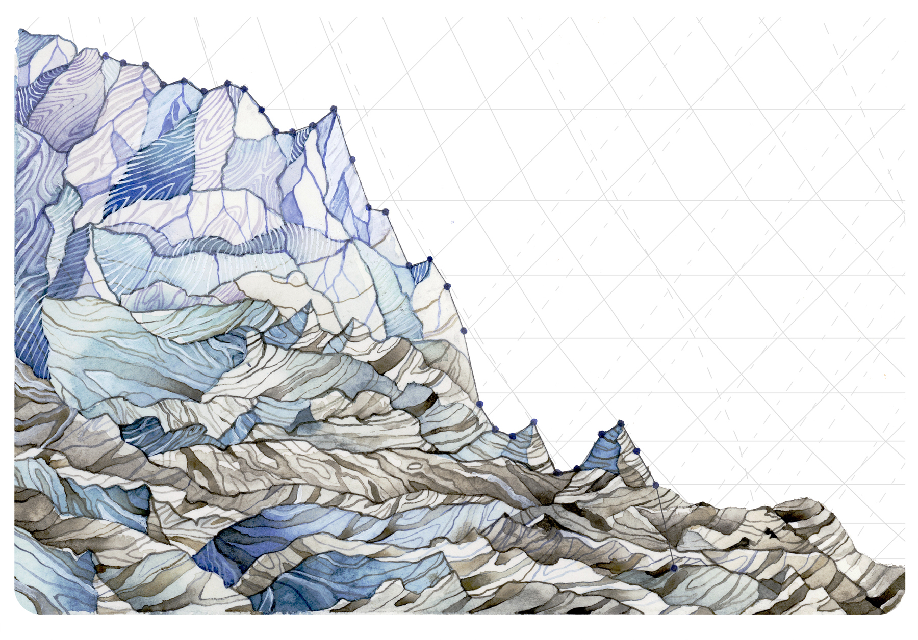
- Can you spot the line graph?
- How does Pelto incorporate the curves (lines) from the original scientific graphs as part of the visual stories that her illustrated graphs tell? Does she use the same approach each time?
- Are there similarities among Pelto’s pieces? Outliers?
- What features of her illustrated graphs do you find particularly powerful and why?
- What data do you think the original graphs depicted, based on Pelto’s illustrated graphs? Refrain from reading her artist’s statement until after you’ve made your guess.
Artist Statements
- What is the focus of the written descriptions that accompany each piece?
- What is the tone and style of the written descriptions?
- Are there similarities among the various written descriptions? Distinct differences?
What are the elements of Jill Pelto’s approach?
- Original Graph: Real scientific data (in the form of a graph) that is the inspiration for the project. Integrated into the illustrated graph. Does not have to be climate change-focused, although a selection of these graphs is provided.
- Illustrated Graph: Melding of the original graph and art to tell a visual story. May communicate causes, impacts, implications, etc. Visual details always connect to scientific data.
- Artist’s Statement: Artist’s description of the illustrated graph. Provides the viewer with an explanation of the link between the visual choices made by the artist and the underlying scientific data.
Select a Graph to Illustrate
“Scientific research and data fuel the content of my artwork.” —Jill Pelto
Graphs of scientific data can provide a fascinating window into the relationship between variables. Illustrated graphs add context by revealing stories that somehow connect to the data, like the one that inspired Pelto’s clownfish piece above.
Identifying a scientific graph that resonates with you is the first step in creating an illustrated graph. Think about different impacts of climate change you’ve read or heard about. To learn more about the effects of climate change and to find climate data that interests you, take a look at the National Climate Assessment, NASA’s Vital Signs of the Planet, NOAA’s Climate.gov, and, for educators, the CLEAN Network.
Which of those stories had the biggest impact on you?
Is there a climate change effect that most inspires you to act to help combat climate change?
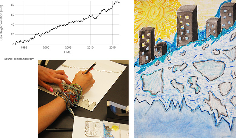
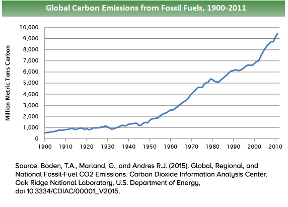
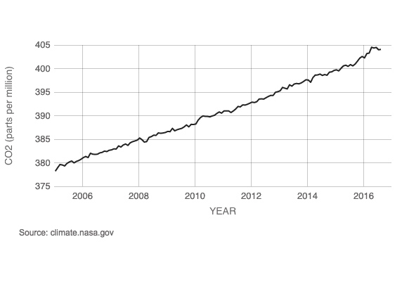
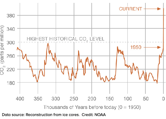
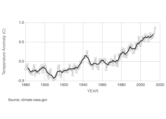
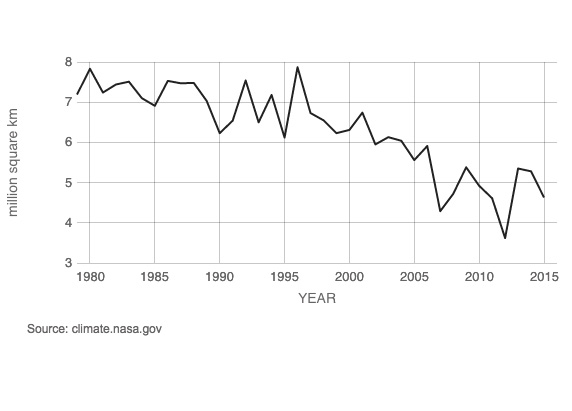
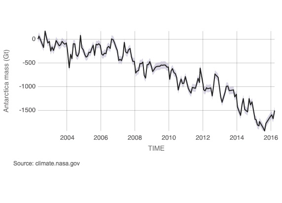
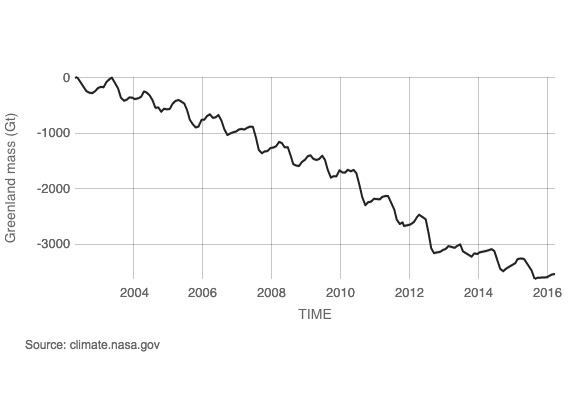
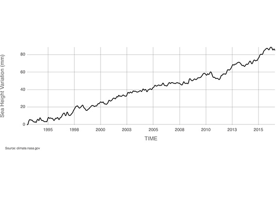
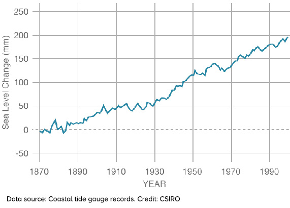
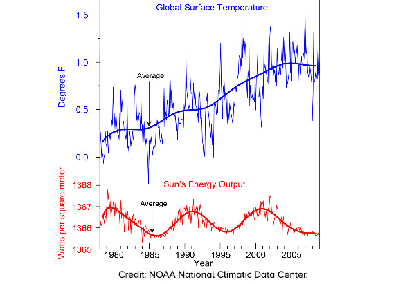
The original graph you select must ultimately allow you to visually convey one or more details that somehow relate to the data in the graph. Explore this curated selection of Climate Change Graphs to find one that contains a story you want to tell.
You will know that you’ve selected a promising original graph if you can answer yes to the following questions:
- Does the graph address a topic that is meaningful or relevant to you?
- Does the graph illustrate a clear trend or change?
- Can you imagine ways that you might integrate the curve of the original graph into a visual story?
You can create illustrated graphs for topics other than climate change, but be sure to choose scientific graphs that are produced by reputable organizations, that show clear trends, and that are presented in a manner conducive to your quest to turn them into powerful illustrated graphs.
Create an Illustrated Graph
The success of your illustrated graph will likely correlate with the amount of time you spend brainstorming. Pelto often spends as much time planning her pieces as she does actually creating them. You should try arranging visual elements in various ways, perhaps by sketching different compositions that will inform your final piece.
Brainstorming Process
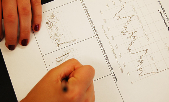
- If you’re using one of the Original Climate Change Graphs from above, print a copy of the
Brainstorm Template that matches your graph. - Use the three boxes containing just the curve of the original graph to create thumbnail sketches of different ways to illustrate your piece.
- It is easy to fall into a narrow line of thinking when brainstorming how to turn a scientific graph into an illustrated graph. Ask for feedback on your sketches before proceeding.
As you describe your thumbnail sketches to others, use phrases such as:
- “In this sketch, you can see that I used the curve of the original graph to…”
- “What I am trying to show here is…”
- “The data relates to this sketch because…”
Encourage others to offer you feedback using language such as:
- “What I like about this sketch is…”
- “Can you talk a little more about…”
- “Have you considered…”
Illustrating
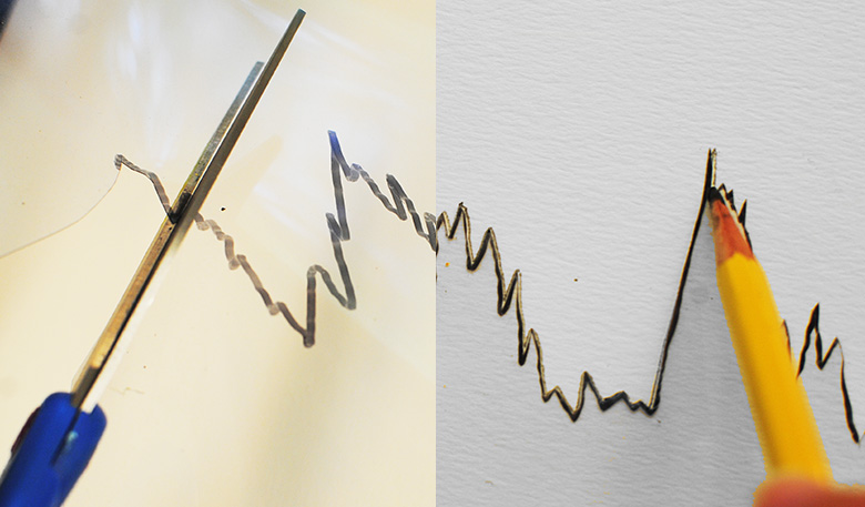
On the backside of each Brainstorm Template, there is an enlarged version of the same curve you used in your thumbnail sketches. You can either trace that curve onto a larger piece of drawing paper or photocopy it onto a transparency for use with watercolor paper.
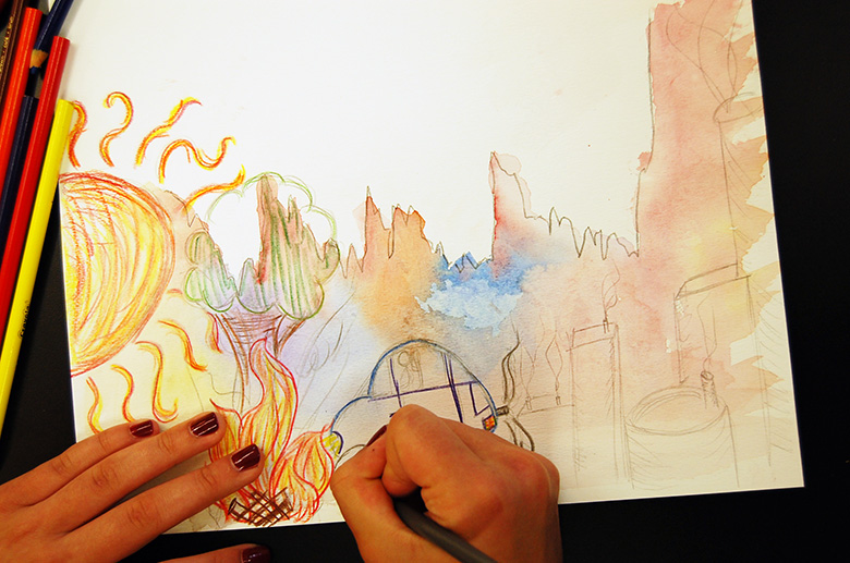
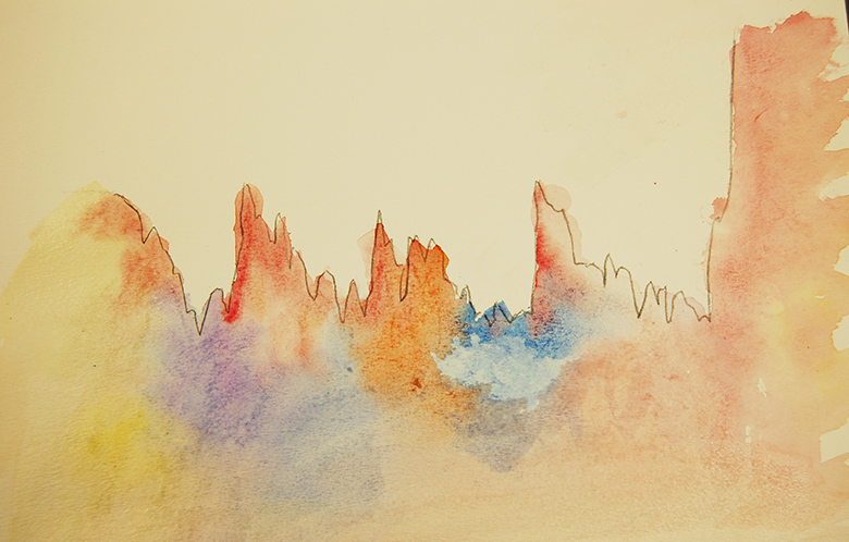
When creating your final illustrated graph, let your creativity go wild! Arrange and display the visual elements of your illustrated graph in whatever manner you choose, using whatever medium—watercolor paints or pencils, pen and ink, markers, digital mash-ups, etc.—you deem most fitting for the story you are trying to tell (e.g., consequences, causes, implications, etc.). An impactful illustrated graph could home in on a specific story tied to scientific research, incorporate two or more related graphs, or lean toward the abstract.
Craft an Artist’s Statement
A well-written artist’s statement conveys to the viewer the rationale behind the work—the who, where, how, and why that led to its creation. Your artist’s statement should address any ambiguities or questions that might exist if a viewer were to place your original and illustrated graphs side-by-side.
To create your artist’s statement:
- Create a short title for your illustrated graph.
- Describe the significance of the original graph.
- Explain the relationship between the illustration and the underlying scientific data. In other words, briefly tell the story that your image conveys about the data.
- Explain any personal connections to the data or why this particular graph/data set inspired your piece.
- Provide a link to the source of the original graph that viewers can visit to learn more.
While your artist statement should reflect careful attention to grammar and discuss detailed scientific content, you should not hesitate to write in the first person when describing artistic choices you made or the meaning the data holds for you. Remember that the goal of your artist’s statement is to provide the viewer with insight into your artistic choices, so try not to overwhelm the reader with excess scientific jargon or lengthy descriptions/explanations. Limit your statement to 150-250 words. You can use this guide to drafting an artist’s statement to help you.
Use the Illustrated Graph Checklist & Rubric to review and score your finished art!
Join the #illustratedgraph Gallery
Share your work and view the work of others on Instagram and Twitter with the hashtag #illustratedgraph.
Include all three elements—your illustrated graph, original graph, and artist’s statement—when you use whatever social media you prefer. To really take advantage of the power of social media, consider whom you might tag in your tweet or post. Are the scientists, organizations, or institutions involved with the research behind your original graph active on social media? Mention them! Know any artists or art institutions that especially appreciate science? Do you work with a school or other organization committed to science education that has a presence on social media? Tag them!
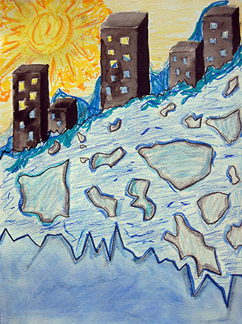
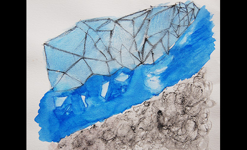
Illustrated Graph Gallery
7th grader uses Arctic sea ice data to create a beautiful #illustratedgraph. #STEM lesson by @Physci8 @scifri with @GlaciogenicArt ?? pic.twitter.com/hJiWqkcTOK
— Cristina Veresan (@CVeresan) January 5, 2017
My student used Amazon deforestation data to create a beautiful #illustratedgraph. #STEM lesson by @Physci8 @scifri with @GlaciogenicArt ?? pic.twitter.com/ocsRN7cgSP
— Cristina Veresan (@CVeresan) January 5, 2017
Can you spot the line graphs? Amazing 7th grade #illustratedgraph #SciArt enlivens data! Lesson by @Physci8 @scifri with @GlaciogenicArt ?? pic.twitter.com/XFMnha4o7Z
— Cristina Veresan (@CVeresan) January 5, 2017
Thank you @CVeresan and @scifri for the best new data analysis lesson #illustratedgraph pic.twitter.com/IquIuNGtIN
— Katie Brown (@Katiekbay) January 25, 2017
NGSS Standard
MS-ESS3-5: Ask questions to clarify evidence of the factors that have caused the rise in global temperatures over the past century.
Our selection of graphs was based on NASA’s Global Climate Change: Vital Signs of the Planet, find more climate change graphs and data at Climate.gov Global Climate Dashboard or in the National Climate Assessment.
Educator's Toolbox
Meet the Writer

About Ryan Becker
@physci8Ryan Becker teaches science at Woodstock Union Middle School in Woodstock, Vermont. A passionate middle level educator for the last 15 years, Ryan constantly looks for ways to nurture curiosity, creativity and problem solving in his classroom. It’s not unusual to find his students engineering solar collectors, creating science videos, writing science haikus, and exploring who scientists are, as well as how, where, and why they do what they do.